9 Behavioral case study #1: Heterogeneous treatment effects of financial aid nudges
We can better illustrate the application of these methods using a real data set from our behavioral science intervention from case study #1 in Section 1. The intervention to increase early submission of the FAFSA provides us with the intervention context we need to estimate heterogeneous treatment effects, map an optimal policy to individuals in the data, and understand the implications of this exercise for designing and implementing real-world experiments. The analysis presented in this section builds on Athey et al. (2020).
For the estimation of heterogeneous treatment effects, we consider a randomly chosen training sample of 17,755 students and withhold the remaining quarter of the data as an additional hold-out test sample. Our data includes baseline demographic, academic, and administrative information about the community-college students in the experiment. On average, the students are around 24 years old, with a considerable standard deviation of almost 7 years. Our sample includes more women (57%) than men. A majority of students are Hispanic (52%), followed by Black non-Hispanic students who make up around a third of the student body in this study. Almost 20% of students are known to study part-time.
First, we consider whether the FAFSA experiment meets our two assumptions of unconfoundedness and overlap. Since we are in a randomized control trial environment, we know each of these assumptions to hold. However, looking at the distribution of propensity scores, broken out by treatment status, can help us verify the overlap assumption. In a randomized experiment, we expect that the distribution of propensity scores should be roughly the same between treatment and control groups, because the two groups should be similar in the distribution of individual characteristics. Overall, we do not observe large imbalances between treatment and control groups. The estimated propensity scores are concentrated around their mean and balanced between the treatment and control groups. We can also directly check for balance between some of the covariates. If we do that, none of nine baseline characteristics we test is significantly different between treatment and control at the 5% level.
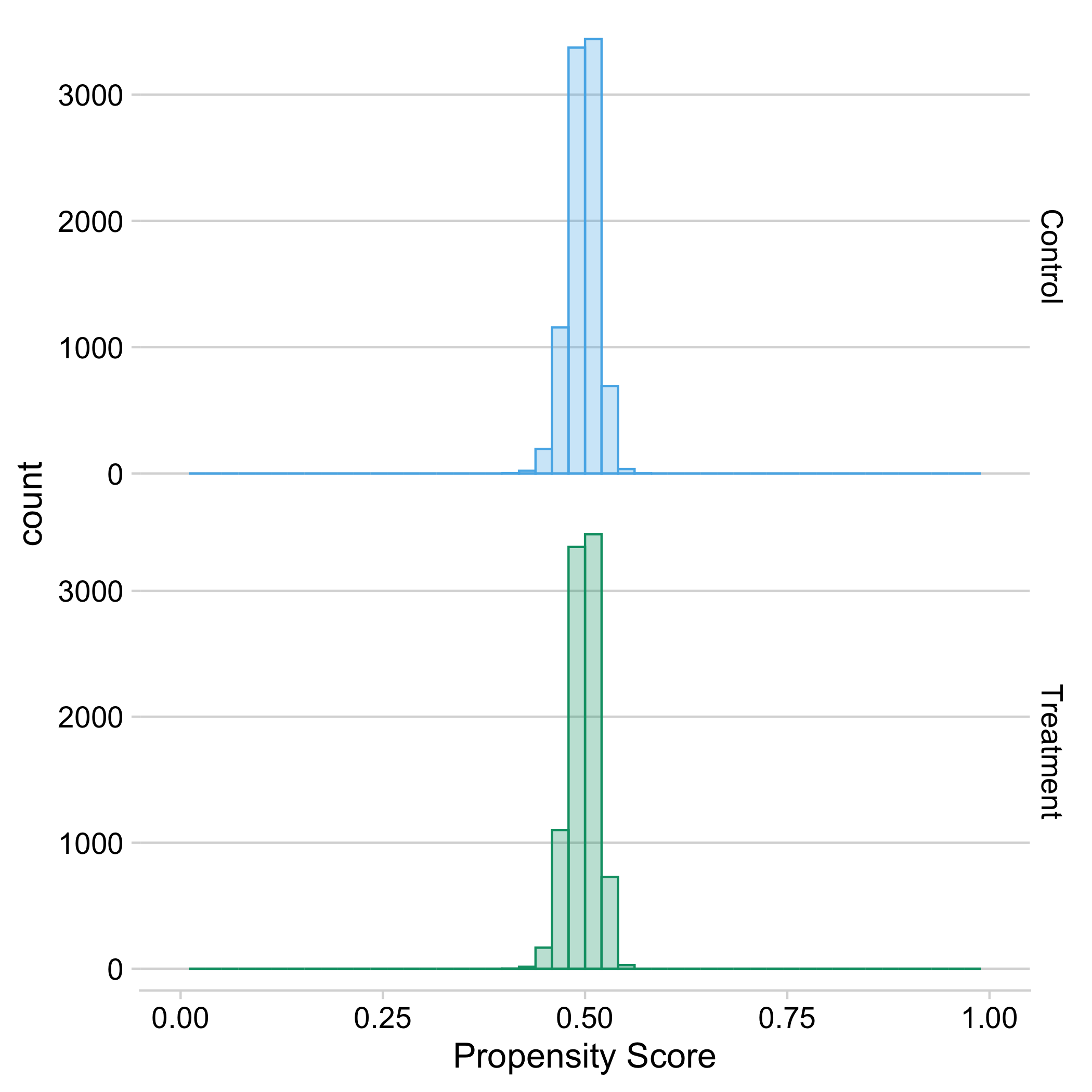
Figure 9.1: Distribution of estimated propensity scores by treatment status, where propensity scores are estimated using a random forest algorithm.
Second, we build an honest causal tree and estimate treatment effects in each leaf. We use cross-validation to prune the tree using a first sample, and then generate unbiased estimates on a second sample. We obtain a causal tree with seven leaves, which vary in treatment effect from -5.8% to 10.0%. The largest leaf makes up more than half of the students and has an estimated treatment effect of 5.0%, while leaves with negative estimated average treatment effects make up less than 1% of students overall.
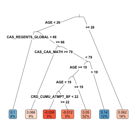
Figure 9.2: Causal tree with estimated average treatment effect and proportion of students in each leaf. The tree splits by age at beginning of the study (AGE), high school performance metrics (CAS_REGENTS_GLOBAL and CAS_CAA_MATH), and cumulative credits attempted before the study (CRD_CUMU_ATMPT_BF). Cutoff values and leaf proportions are rounded to the closest integer (which explains why the tree appears to split around age 19 twice.)
Before we have a closer look at the leaves of this tree, we discuss the importance of “honesty” in estimating treatment effects in the causal tree. All treatment effects we describe here are estimated on a part of the sample that was not used to fit the tree. For illustration, we also calculate treatment effects in the training sample the tree is fitted on, and compare them to the honest estimates. We see that the two sets of estimates differ significantly. Overall, the training sample estimates overstate the amount of heterogeneity across leaves. Many of these estimates are more extreme than their honest in-sample counterparts. This is because the tree splits between groups of people that happen to have large differences in their estimated treatment effects in the training sample. Since some of this variation is due to noise, the resulting estimates are systematically biased. For example, for the leaf that has an estimated treatment effect of -64.8% in the training data, the honest estimate is only -5.8%.
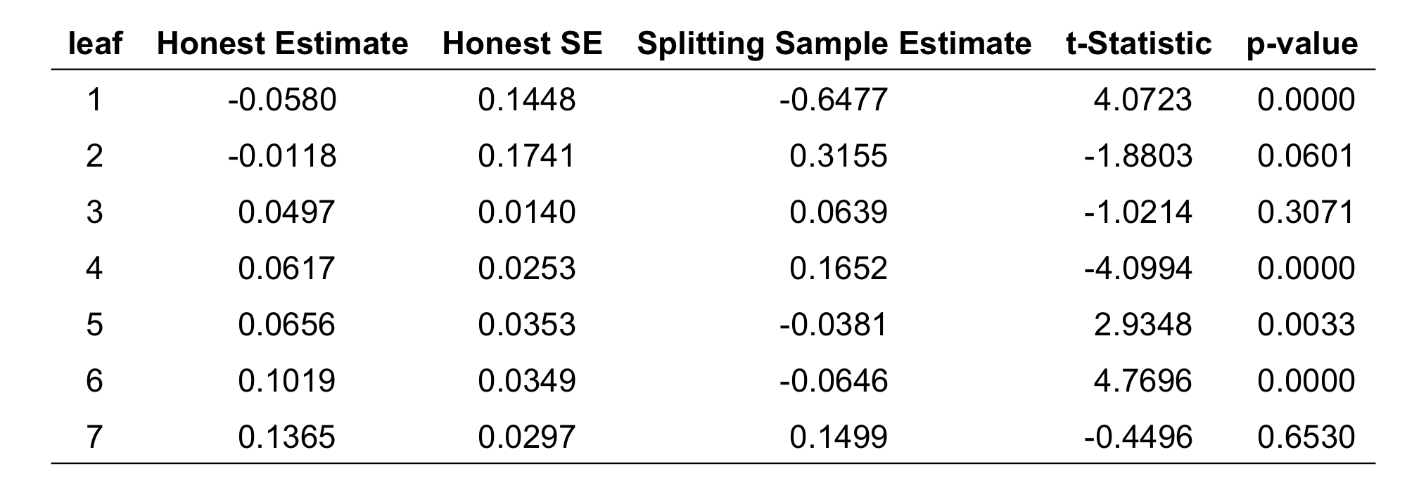
Figure 9.3: Comparison of average treatment effect estimates in the leaves by whether they were calculated in the first part of the sample, where the tree is fitted (“Splitting Sample Estimate”), or in the second part of the sample (“Honest Estimate”), which was set aside when fitting the tree. The “Honest SE” are the standard errors of the honest estimates in the second part of the sample. For each leaf, the table also includes the t-statistic and the p-values for the test that the “Honest Estimate” and the “Splitting Sample Estimate” are the same, based on the honest standard error. Leaves are ordered by honest estimates.
The causal tree searches for splits that maximize the observed differences in treatment effects across leaves. But just because the tree finds some splits does not ensure that it successfully identifies heterogeneous treatment effects. After all, the differences between leaves in the training sample could be due to noise. We therefore test whether the leaves have different treatment effects, using the honest estimates from the additional part of the sample that was not used to fit the tree. In our example, we find that only a few differences between leaves are actually statistically significant. Only the two largest leaves, with average treatment effects of 5.0% and 6.2%, respectively, have average treatment effects that are significantly different from the leaf with the highest estimated treatment effect at the 5% significance level (see Figure 9.4). If we correct for the fact that we run a total of 21 pairwise comparisons using a Bonferroni correction, none of the pairwise comparisons is significant at the adjusted significance level. So we cannot rule out that the heterogeneity described by this tree is due to noise.
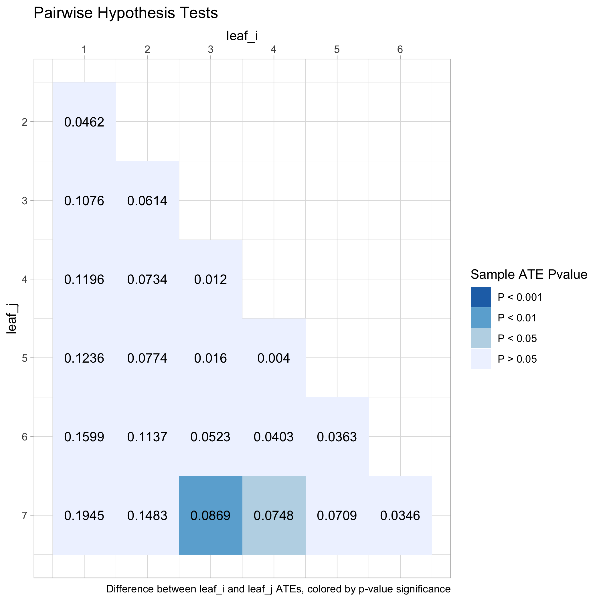
Figure 9.4: Pairwise differences in honest average treatment effect estimates across leaves of the causal tree, colored by p-values from test of pairwise equality.
When interpreting results from the causal tree, it is important not to put too much emphasis on the variables that are used to define subgroups (leaves). That is because there can be many different ways to describe (roughly) the same individuals, particularly if covariates are correlated. If the tree splits according to one covariate, there is little additional value to splitting again with covariates that are highly correlated. A more principled way to describe leaves is by their characteristics, considering all covariates, not just those that were used to define the leaves. We thus assess heterogeneity by examining how each covariate differs across leaves. For this specific tree, we find that mathematics high school performance and age vary most across leaves. As we would expect, many of the variables covary strongly across leaves. For example, the FAFSA dependency status covaries with age. This makes sense, since a “dependent” student is typically a younger, unmarried student without children. So every split in age also creates groups that are different by dependency status.
Overall, the analysis of heterogeneous treatment effects using the causal tree remains inconclusive. The leaf with the highest estimated treatment effects contains students that tend to be younger, who have attempted less credits and have below-average math results. But those leaves with the lowest estimated treatment effects have similar covariate averages. Overall, the differences between treatment effects in leaves are noisy and not significant when we adjust for multiple testing. We will consider more powerful methods for estimating whether there are heterogeneous treatment effects below.
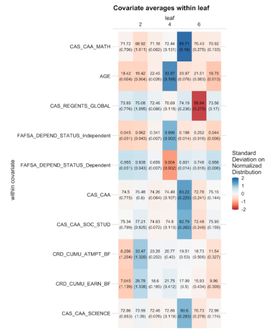
Figure 9.5: Average covariate values across leaves of the causal tree. Each column corresponds to one leaf. Each row lists the average of the corresponding variable across leaves, together with a standard error. Colors express each average in terms of standard deviations from the mean of the respective covariate, where red corresponds to minus two standard deviations and blue corresponds to plus two standard deviations. The table shows the top ten variables by variation of normalized means across leaves.
Forest from the trees: Next, we implement a causal forest to estimate more precise heterogeneous treatment effects. Recall that causal trees and causal forests answer different questions. While the causal tree yields a partition of the space into discrete groups that have different treatment effects, causal forests estimate the treatment effects for each particular point in the covariate space, and are not a method for subgroup analysis. When we look at the pointwise estimates for all the students in our training sample, we see substantial spread in estimated treatment effects. We do not find any negative treatment effect estimates, leading us to conclude that reminders are unlikely to have caused any students not to file by the priority deadline.
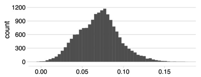
Figure 9.6: Histogram of estimated conditional treatment effects.
We see a spread in estimated treatment effects, but that does not necessarily imply that there is a lot of predictable heterogeneity in the true treatment effect. Although the forest provides honest estimates of treatment effects, these estimates may still be noisy due to sampling variation. For the causal tree, it was important to test whether the effects across leaves were actually different. For the causal forest, we similarly want to find evidence that the spread is not just due to noise. This was easy for the tree, since we could simply run t-tests for the differences between leaves. Since the forest provides separate estimates for every value of the covariates, we need an additional step to construct a test.
A commonly used way of testing for heterogeneous treatment effects is to split up the students into groups, say by quartiles of estimated treatment effect, and estimate the average treatment effect within each quartile (see e.g. Chernozhukov et al. (2018)). When we do this, we have to make sure that the data we use to decide which group a student falls in is not the same that we use to test its treatment effect. Otherwise, our test would be biased. For example, if we use a training dataset to build a model \(\hat\tau\) that maps student characteristics \(X\) to estimated treatment effects \(\hat\tau(X)\), we could use a separate hold-out dataset to evaluate that model. To do so, we apply our function \(\hat\tau\) from the training data to the students in the hold-out dataset. For each student in the hold-out data, we obtain a prediction of their treatment effect. We then divide these students into quartiles of predicted treatment effects. Once we have formed these four groups, we can estimate the average treatment effect in each group on the hold-out data without relying on the previously estimated model of \(\hat\tau\) beyond assigning individuals to groups. If our model \(\hat\tau\) was a good one, we expect the lowest quartile of predicted treatment effects to yield the smallest average treatment effect estimates, and so on. This way, we can test whether we have indeed found heterogeneous treatment effects. However, using a hold-out dataset is costly, since it reduces the sample size for the causal forest and for the estimation of average treatment effects. Instead, we use sample splitting on the training dataset to ensure that the fitting and estimation of the trees in the forest is separate from the estimation of average treatment effects within groups.3 We then test whether the treatment effects are different across these groups.
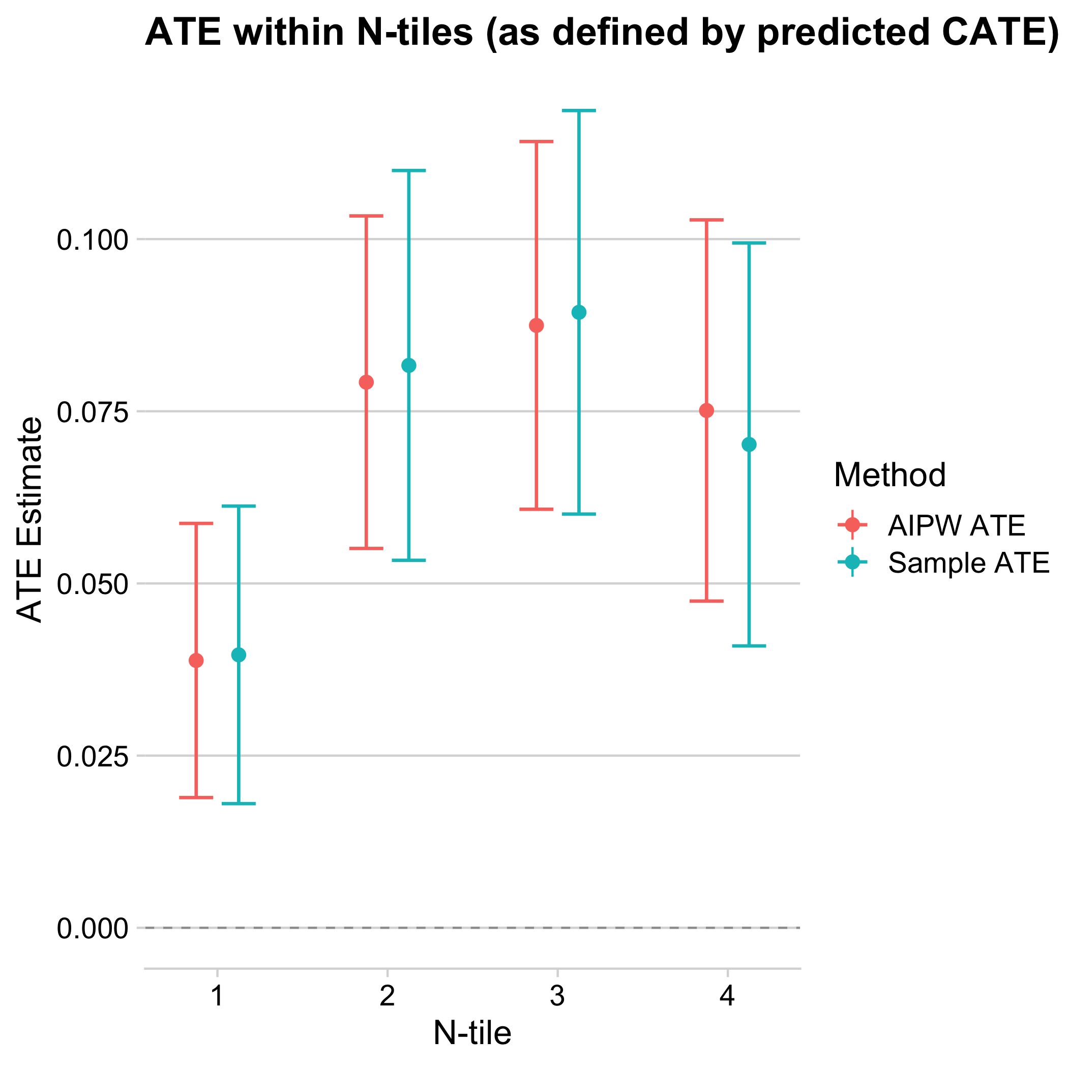
Figure 9.7: Average treatment effects by quartiles of estimated treatment effects. The x-axis divides the sample into quartiles of cross-fitted estimated treatment effects. The y-axis plots a simple difference-in-averages (cyan) as well as an augmented inverse-propensity weighted (red) estimator of the average treatment effect of the group, along with a 95% confidence interval.
Above we plot both the sample average treatment effect (ATE) and “AIPW” ATE across quartiles of estimated treatment effects. The sample ATE is simply the difference of the mean outcomes of the treatment and control groups. The AIPW ATE takes a more sophisticated approach that includes (1) adjusting for the predicted outcome according to the covariates and (2) weighting by the propensity score. This first method is important because it is clear and easily calculated from the data; the second is valuable because, if constructed using causal forests, it yields estimates that have smaller variance for large numbers of samples, and correct for possible imbalances between treatment and control groups. To calculate the AIPW estimate, let \(\hat f(x)\) be a (cross-fitted) prediction of the outcome from covariates, \(\hat\tau(x)\) the estimate of the treatment effect at the given covariate from the causal forest, and \(p(x)\) the propensity score (which we may replace with its cross-fitted estimated counterpart \(\hat p(x)\) if there is imbalance). Write \(\hat f{_1}(x) = \hat f(X) + (1-p(X))\hat\tau(X), \hat f_{0}(X) = \hat f(X) - p(X)\hat\tau(X)\) . Then the AIPW estimate of the average treatment effect in a group \(G\) is:
\[{1 \over |G|} \sum_{\substack{i \in G}} \hat\tau(X_i) + {W_i - p(X_i) \over p(X_i)(1-p(X_i))}(Y_i - \hat f_{W_i}(X)) \]
In practice, the sample ATE and AIPW should give similar results. If the AIPW ATE and sample ATE are dramatically different within subgroups, that may be a flag that something is wrong. If you run into that problem in an application, consider looking at the unconfoundedness assumption or whether there is a problem in the estimation of nuisance parameters that enter AIPW estimates of the ATEs.
Looking at the above graph, the average treatment effect in the lowest quartile of estimated effects is around 4 percentage points, which is significantly lower than the average in the remaining sample (around 8 percentage points). The confidence interval of the lowest quartile does not include the other quartiles’ average treatment effects, and does not overlap much with their confidence intervals. We can perform a statistical test for each quartile against each other to see that these pairwise differences are indeed significant at the 5% level.
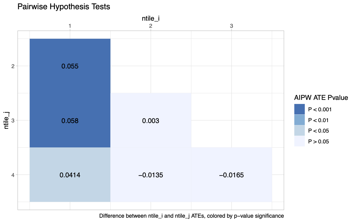
Figure 9.8: Pairwise differences in average treatment effects between quartiles of cross-fitted estimated treatment effects, with p-values for pairwise two-sided tests of equality.
We next inspect which variables vary the most along with treatment effects predicted by the causal forests. When we order variables according to how much they vary across quartiles of estimated treatment effects, we find that whether a student is enrolled at the time the reminders are sent is associated most with estimated heterogeneity. Close to 80% of students in the lowest quartile of estimated treatment effects are not enrolled at one of the three colleges, compared to less than 1% who are not enrolled in the top quartile. Apart from variables directly associated with enrollment, such as the number of credits attempted in the current semester, students with higher estimated treatment effects are also older and have a higher GPA.
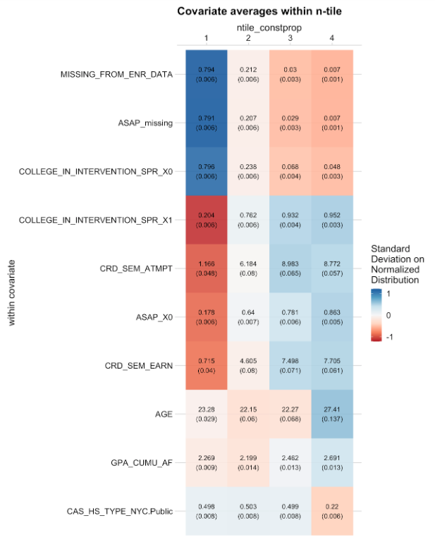
Figure 9.9: Average covariate values across quartiles of cross-fitted estimated treatment effects from the causal forest. Each row lists the average of a variable across quartiles, together with a standard error. Colors express each average in terms of standard deviations from the mean of the respective covariate, where red corresponds to -1.2 standard deviations and blue corresponds to +1.2 standard deviations. The table shows the top ten variables by variation of normalized means across leaves.
We now explore the relationship of treatment effects and enrollment further. If we compare the average treatment effect between the 71.2% of students who are enrolled and those who are not enrolled at the time of the first reminder, we find that the average treatment effect of enrolled students is about 4 percentage points higher. This is similar to the difference between the 71.2% of students with higher estimated treatment effect and the remaining students. So enrollment explains a substantial variation in treatment effects, but there may be additional heterogeneity in treatment effects that the causal forest picks up on. To find out whether that is the case, we also estimate heterogeneous treatment effects just among those students who are enrolled right before reminders are sent out. Heterogeneity is now less pronounced and more noisy, with only the difference between the first and second quartile being significant for the AIPW ATE. Overall, most of the treatment effect heterogeneity appears to relate to enrollment: students who are not enrolled are less likely to be affected by the reminders, likely because they do not file FAFSA, no matter whether they are reminded.
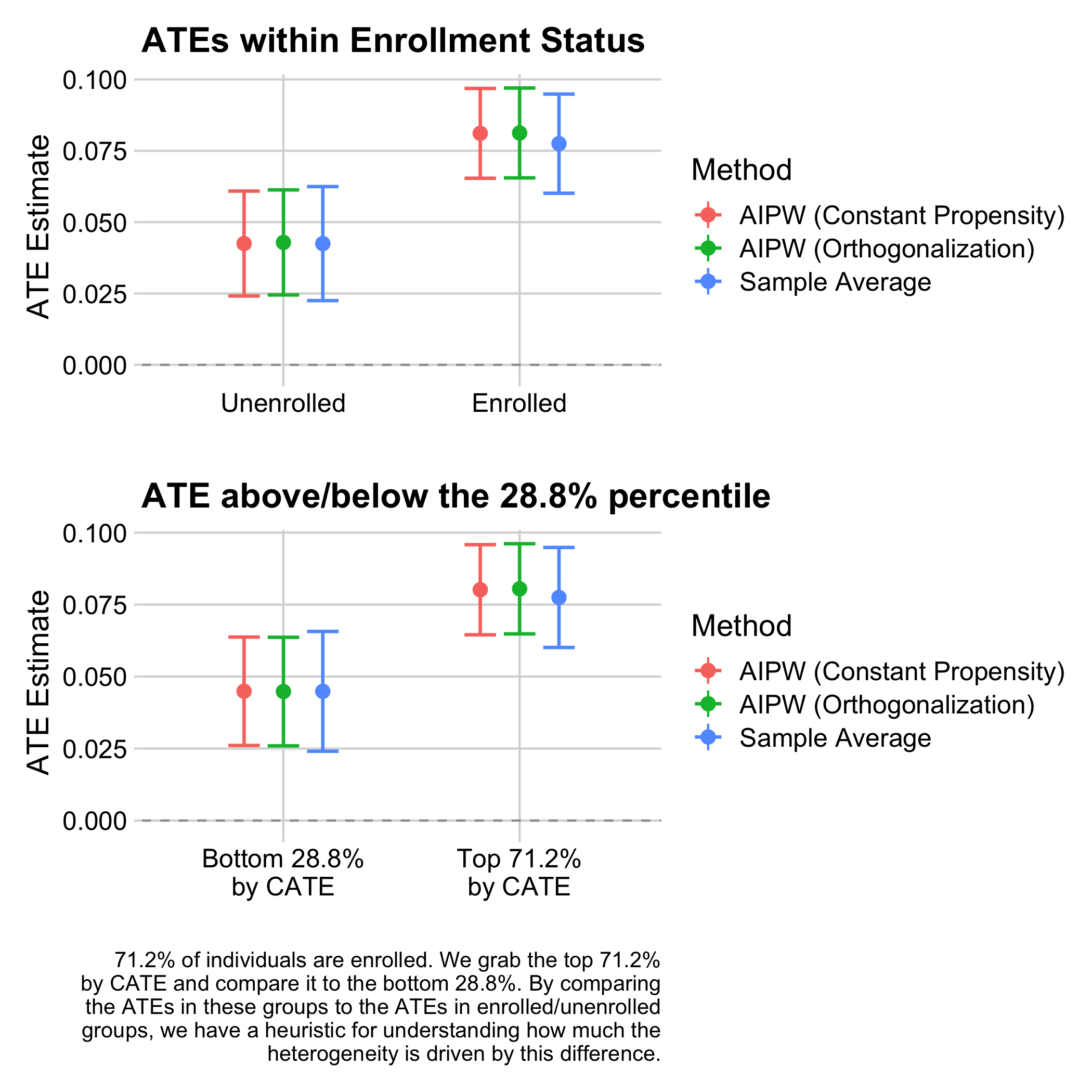
Figure 9.10: Average treatment effects by enrollment status (top) and by whether predicted cross-fitted treatment effects are below or above the quantile corresponding to the proportion of enrolled students (bottom), using all data up to the start of the intervention. The y-axis plots the sample average treatment effect as well as two augmented inverse-propensity weighted (“AIPW”) estimators of treatment effects by group, with batch-wise constant and with estimated propensity scores, of the average treatment effect within the group, along with a 95% confidence interval.
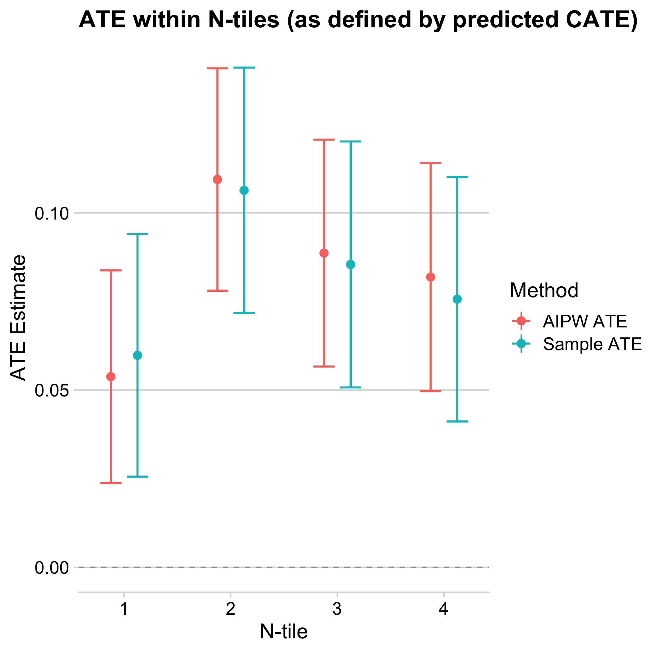
Figure 9.11: Average treatment effects by quartiles of estimated treatment effects among enrolled students. The x-axis divides the sample into quartiles of cross-fitted estimated treatment effects. The y-axis plots a simple difference-in-averages (“Sample ATE”) as well as an augmented inverse-propensity weighted (“Sample AIPW”) estimator of the average treatment effect within each quartile, along with a 95% confidence interval.
Once we have information about heterogeneous treatment effects, we can use it to decide who to treat. For example, sending out reminders may be costly, or we may want to avoid sending ineffective reminders to avoid cluttering inboxes. Our analysis so far suggests that reminders work better for those students who are enrolled. But when students were assigned to the treatment and control groups at the beginning of the semesters, that information was not yet available. We now put ourselves in the shoes of an administrator who wants to decide at the beginning of the semester who to send reminders to, before we know for sure who will not be enrolled. We, therefore, rerun the causal forest only with this early information. We then ask how we could have used heterogeneity information to improve targeting with the reminders. Here is a list of policies we consider for comparison:
- Conditional average treatment effects (CATE): This policy uses the estimated treatment effect from the causal forest and assigns those with higher estimated treatment effects first.
- Baseline: This policy uses a model that predicts the likelihood of filing the FAFSA before the priority deadline without the intervention, then focuses on treating those with the lowest probabilities first. This targeting rule has intuitive appeal since those who are least likely to file are those with the highest potential for the treatment to have a large effect.
- Enrollment: Predicting the likelihood of staying enrolled for the whole semester, this model focuses on treating those with the highest probability of staying enrolled. This policy is informed by our finding that enrollment is related to higher treatment effects.
- Random: This model takes a random sample of people and treats them.
Rather than evaluating the quality of our predictions in terms of raw prediction loss, we quantify which proportion of total gain from the reminders we could have realized when targeting a given fraction of students according to the different policies.
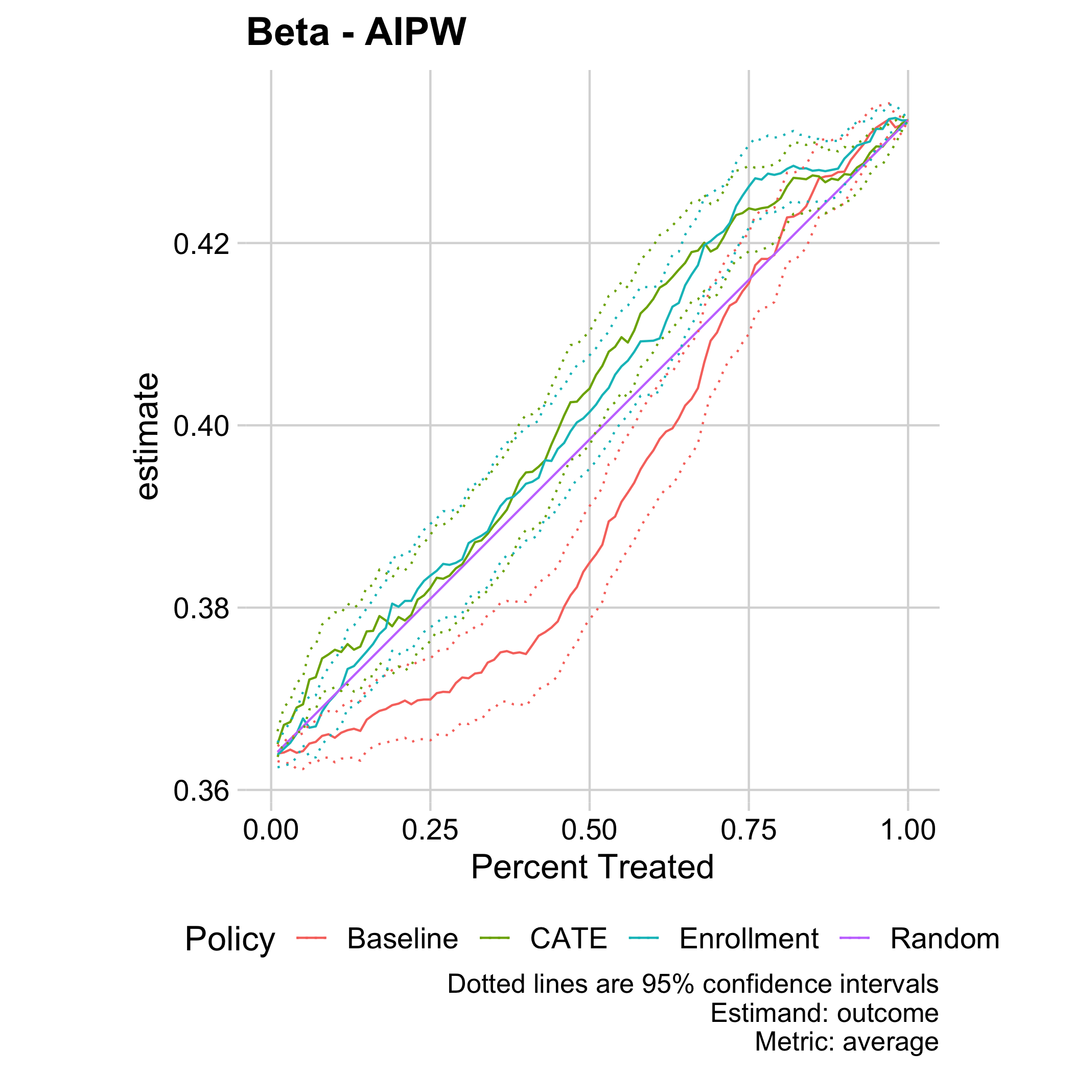
Figure 9.12: Total estimated FAFSA renewal rate (y-axis) by targeting a given fraction (x-axis) of students according to different cross-fitted predictions, including a prediction of outcomes absent treatment (“Baseline”), a prediction of future enrollment (“Enrollment”), and a prediction of treatment effects (“CATE”). Shown are augmented inverse-propensity weighted estimates with pointwise 95% confidence intervals.
Using the treatment effect estimate, we could have increased FAFSA renewal by the priority deadline from the baseline of around 36.5% to 42% (realizing over 80% of the gain) by targeting those 70% of students with the highest estimated effect. A prediction of future enrollment would have been comparatively successful, providing further evidence that heterogeneous treatment effects here are related to enrollment. The purely predictive policy that targets those with low baseline filing rates performs not just significantly worse than the policy based on causal estimation of treatment effects, but indeed even considerably worse than assigning people randomly.
Our results provide an example where naive targeting based on a machine-learning prediction of outcomes performs worse than targeting based on estimates of treatment effects. In particular, consider the approach to targeting where reminders are sent to individuals who are predicted to be least likely to file. Such predictive approaches are appealing, because they can be estimated using historical data, even without having run an experiment. In contrast, to estimate treatment effects, it is necessary to have data where nudges have been sent, ideally experimental data. Here, this predictive approach underperforms relative to randomly assigning the treatment because effects are largest among those who were relatively likely to file without the nudges. These findings thus highlight the value of augmenting machine-learning algorithms, which provide powerful prediction tools, with careful causal inference to tackle policy problems.
How we can boost impact/what this teaches us about behavioral design
Once we have an understanding of those individuals or subgroups for whom we do not recommend treatment based on optimal policy, it is the imperative of the research team to conduct our behavioral mapping process over again for that group. From there, we can take a lateral leap, and design something entirely different from the original treatment to be offered to that group. We suggest, always, that the intervention be rigorously tested using a randomized controlled trial and, thus, presents another opportunity to assess whether there are subgroup level effects within that subset of the original population. In other words, the first optimal policy can be refined and developed iteratively, as new interventions are piloted with the population of interest.
What about those who we don’t impact?
In the case of the FAFSA intervention, we find that the predominant characteristic of those with much lower treatment effects are those who ended up withdrawing from school during the semester. It is possible that these students would benefit from an intervention more involved than reminder texts and emails. A deeper understanding of which students may not benefit from our interventions can also guide us towards alternative approaches that will help those students succeed.
Concretely, we fit the causal forest with honest estimation using K-fold cross-fitting. For every fold that we leave out, we fit the causal forest on all remaining folds, and obtain honest estimates of treatment effects for the left-out fold. We then divide observations into groups by quartiles of outcomes within every fold. We form quartiles separately within folds to avoid biases from ranking observations across folds; see the paper version (Athey et al. (2020)) for details.↩︎